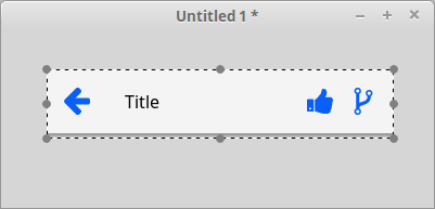
Header bar widget
The title widget is used primary for title bars.
It has a title label, a left icon and any number of right icons.
For each icon you set an action to call.
You may choose to display icon label instead of icon image (SVG format).
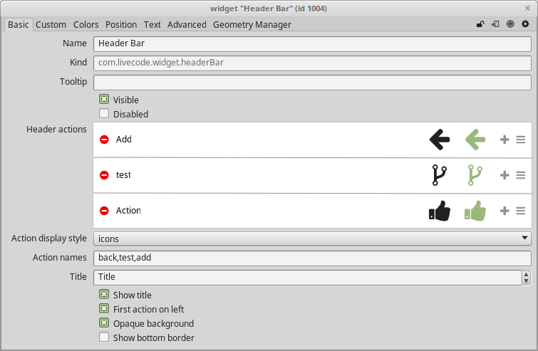
The property inspector show you the order:
- the first icon is the left icon
- the second icon is the most right icon
- the other icons are after the title and the last right icon
You can rearrange order dragging the lines icon of the icon row in the property inspector.
You can add icon clicking on the + icon, you can delete icon clicking on the - icon.
You can change icon and HilitedIcon, they can be different.
Use the MouseAction property, see below, to know which icon is clicked.
Properties[]
- Name
- ToolTip
- backColor
- BorderColor
- firstItemLeft: you choose if the first item should be on the left of the title. Usually this position is for back button. You can set it to true or false.
- foreColor
- HiliteColor
- hilitedItemIcons: A comma delimited list of icon names. Each icon name must be one of the predefined graphics provided by the "IconSVG" library. You can get a list of available predefined path names of iconNames.
- itemArray: it's a number-indexed array that contains all of the information about the header widget's actions. It combines the data accessible via the itemIcons, hilitedItemIcons, itemLabels and itemNames properties. the format is like:
- itemArray[1]["name"]
- itemArray[1]["label"]
- itemArray[1]["icon_name"]
- itemArray[1]["hilited_icon_name"]
- itemIcons: A comma delimited list of the icons names, these icons are displayed by each action when not currently highlighted.
- itemlabels: A comma-delimited list of action labels.
- itemNames: A comma-delimited list of action names
- itemStyle: The way that actions are displayed. it can be "icons" or "text"
- label: The text of the title of the header bar.
- MouseAction: it returns the action that the mouse pointer is currently over. You can use code like this:
on mouseUp
  if the mouseAction of the target is "back" then
     go previous
  end if
end mouseUp
- Opaque
- ShowBorder
- showLabel: Controls whether the header bar displays the label as a title (true) or whether no title is shown (false).
- theme: it can be:
- native
- iOS
- Android