Field object is used for many purpose in LiveCode, is so rich of option that it's used also for text, scrolling fields and much more. Put attention to the basic table object option, since it creates "phantom fields" one per cell like field "revCell-2,3" (row,column); this way intercept message easily when user work with cells.
Basic Properties
- Name
- tool tip
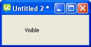
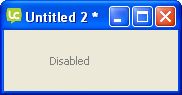
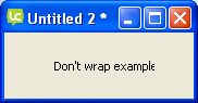
- Style (see slideshow on the right):
- Disabled: it becomes gray and not editable
- Visible: if it's fale, object is invisible
- share text: if you set it as a group, you decide if it's the same on all cards or not.
- Don't wrap
- Lock text: if a text is focusable, you can also specify if user can change it or not.
- Opaque: it measn that background is not transparent
- Focusable: it's mandatory if user has to edit field
- Focus border: Displays a border around the active control.
- Tab on Return: pressing return is the same of tab on this object, so it will pass to the next one.
- Three dimensional: graphic effect
- Show border: a box border visible
- Scrollbars
- Hilites
- auto hilite
- List behaviour
- Line height
- Layer mode
- Behavior


Contents
Here there is a large area where you can add your contents, seeing it with thw wrap line on, trasnform it into a table, or load from a file. This property is called TEXT. Example:
set the text of field "myfield" to "Hello world"
When the content is set like a table, content is a simple tabbed text. Every cell is separated from the other with a TAB, every line is separated from the other with a newline. For example, the following can be a 3x3 table:
11	12	13
21	22	23
31	32	33
Creating a TABBED table is easy, look the following example:
put "11" & tab & "12" & return & "21" & tab & "22" into myvar
In a scrolling list, every line is a line list.
Table
Here you can transform the object in a table, setting if editable or not, formatting or not, tab stop size, and many other option.
- basic table object: this option activate table capabilities
- cell editing: user can edit text cel by cel
- maximum editable column: last column user can edit
- cell formatting:
- text baseline: show dotted horizontal lines
- horizontal grid: activate table horizontal lines
- vertical grid: activate table vertical lines
- tab stops: number of pixels of column width
Icons & Border
- Icon
- Hilite Icon: icon when the button is pressed
- Disabled Icon: icon when the button is disabled
- Visited Icon: icon when the button was pressed at least one time. You can reset a visited button setting the visited property to false
- Armed Icon
- Hover Icon: when mouse is on the object
- Three D: effect of the button
- Border: border of the button
- Hilite border: special border when pressed
- Border width
- Shadow: shadow effect of the button
- Shadow offset: distance of the shadow from the button
Colors & patterns
Here you can set the color of vaious elements of the button. You can choose a pattern instead of a color.
Custom properties
Custom properties are the best replacemnte for variable in Livecode. You can use variables in Livecode, but usually they are just temporary; on the contrary cutom properies are real containers for all your data. Easy to recover and to check.
Geometry
See Geometry manager
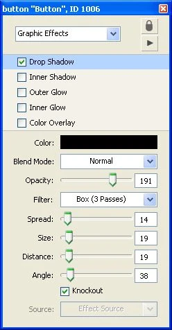
Graphic effects
Here yo can activate and mix many effects:
- drop shadow
- inner shadow
- outer glow
- inner glow
- color overlay
If you activate the drop shadow, you can manitulape all aspects of it (color, opacity, position, etc.) with the submenu.
Blending
The blending effect is a way to make the object transparent, you can choose between many way to render the resulting object (artihmentic, subpin, etc.). You can choose the percentage of blending your objenct with the background.
Property profiles
All the property of an object are inherited from a master profile, however you can add and change profile. This way all objects will have the same properties, will look the same or act the same.
Size & Position
Here you can
- specify the size of the object
- fit it to text content
- set location using the centre of the object or its borders
- lock size and position
- choosing which element is above the others, specifying object layer
Text formatting
Here you can change:
- font type
- font size (you can enter size directly, you are not restricted to the few showed)
- font style:
- plain
- bold
- italic
- underlined
- boxed
- boxed 3D
- link
- stroked
- alignment
- margins
You can also change all letter to uppercase, lowercase or else using tha last button.