In LiveCode, a Button object comes in many different styles: Push, square, round buttons, check boxes and radio buttons. In reality, there is only one button control, with many different properties. Which properties are set, will determine which type of Button is displayed. But, its usually easier to just pick the type you want in the first place.
Buttons They are all just different vethrn the rest asions of the same type of obejct, namely buttons.
The radio buttons are a little different and must be grouped. Their status is the hilite property.
Basic Properties[]
- Name
- IconGravity
- Label, the text shown on the selected item.
- tool tip
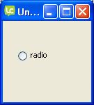
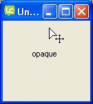
- Style (see the slide-show on the right):
- Push button
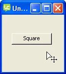
- Square button
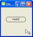
- round button
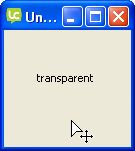
- transparent button
- opaque button
- shadow button
- check box
- radio button
- option
- combobox
- popup
- pull down
- Style options:
- visible: if it's set false, it's invisible. When an object is invisible use the stack browser to edit it.
- opaque: if it's set false, it has the same color of the background
- show name: if it's set false, the label is not shown
- auto hilite
- shared hilite
- shortcut and hint
- Focus with keyboard
- Show focus border
- Mnemonic
- Default button
- Disabled
- Layer mode
- Behavior


Icons & Border[]
- Icon (remember to include a button for each icon you want to use)
- Hilite Icon: icon when the button is pressed
- Disabled Icon: icon when the button is disabled
- Visited Icon: icon when the button was pressed at least one time. You can reset a visited button setting the visited property to false
- Armed Icon
- Hover Icon: when mouse is on the object
- Three D: effect of the button
- Border: border of the button
- Hilite border: special border when pressed
- Border width
- Shadow: shadow effect of the button
- Shadow offset: distance of the shadow from the button
Colors & patterns[]
Here you can set the color of various elements of the button. You can choose a pattern instead of a color.
Custom properties[]
Using Custom properties as an alternative for variables in Livecode. Custom properties are permanent containers for any data assigned to them and are saved as part of the program. Information stored in a custom property is easy to retrieve and to check.
Geometry[]
See Geometry manager
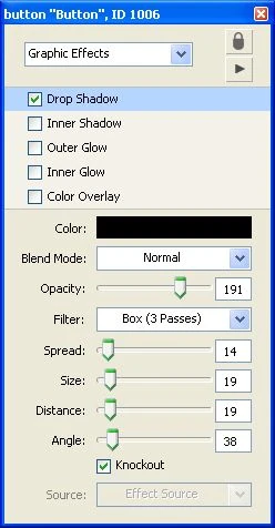
Graphic effects[]
Here yo can activate and mix many effects:
- drop shadow
- inner shadow
- outer glow
- inner glow
- color overlay
If you activate the drop shadow, you can manipulate all aspects of it (color, opacity, position, etc.) with the sub-menu.
Blending[]
The blending effect is a way to make the object more or less transparent, you can choose between many ways to render the resulting object (arithmetic, subpin, etc.).
You can choose the percentage of blending your object has with the background, from 0 (completely transparent) to 255 (completely opaque) .
Property profiles[]
All the properties of an object are inherited from a master profile, however you can add and change profile. This way all objects will have the same properties, will look the same or act the same.
Size & Position[]
- specify the size of the object
- fit it to text content
- set location using the center of the object or its borders
- lock size and position
- choose which element is above the others by specifying object layer
Text formatting[]
- font type
- font size (select one of the sizes shown or enter your own)
- font style:
- plain
- bold
- italic
- underlined
- boxed
- boxed 3D
- link
- strike-out
- alignment
- margins
You can also change all letters to uppercase, lowercase, sentence, or Title using the Change Case button.
All Button properties[]
If there is a missing property, please add it.
- accelKey
- accelMods
- accelText
- altId
- armBorder
- armed
- armedIcon
- armFill
- autoArm
- autoHilite
- backColor
- backPattern
- behavior
- blendLevel
- borderColor
- borderPattern
- borderWidth
- bottomColor
- bottomPattern
- cantSelect
- colorOverlay
- default
- disabled
- disabledIcon
- dropShadow
- family
- focusColor
- focusPattern
- foreColor
- forePattern
- hiliteBorder
- hiliteColor
- hilited
- hiliteFill
- hiliteIcon
- hilitePattern
- hoverIcon
- icon
- iconGravity
- id
- ink
- innerGlow
- innerShadow
- label
- labelWidth
- layer
- layerMode
- lockLoc
- margins
- menuHistory
- menuLines
- menuMode
- menuMouseButton
- menuName
- mnemonic
- name
- opaque
- outerGlow
- rect
- shadow
- shadowColor
- shadowOffset
- shadowPattern
- sharedHilite
- showBorder
- showFocusBorder
- showHilite
- showIcon
- showName
- style
- text
- textAlign
- textFont
- textSize
- textStyle
- threeD
- titleWidth
- toolTip
- topColor
- topPattern
- traversalOn
- visible
- visitedIcon